Choosing colors for window shades or blinds means balancing visual appeal, functionality, and practicality all at once. Neutral tones bring flexibility and understated elegance, bold hues add personality and drama, while the right lightness or darkness can influence lighting, privacy, and efficiency in surprising ways.
Key Considerations
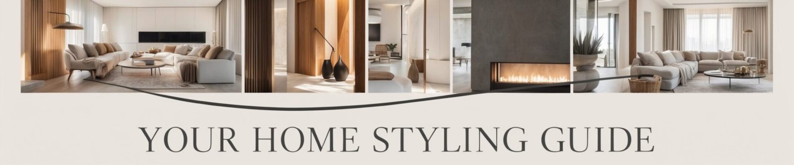
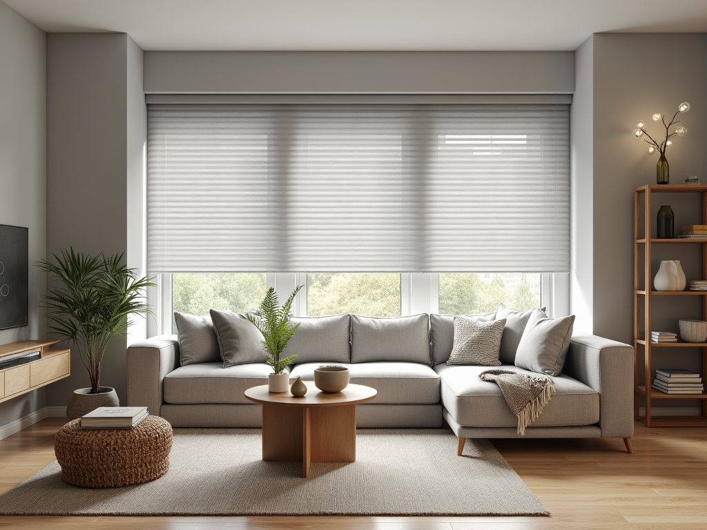
- Versatile neutrals: Shades like white, gray, or beige effortlessly complement any design style. They help create a cohesive, timeless look that won’t overpower a space.
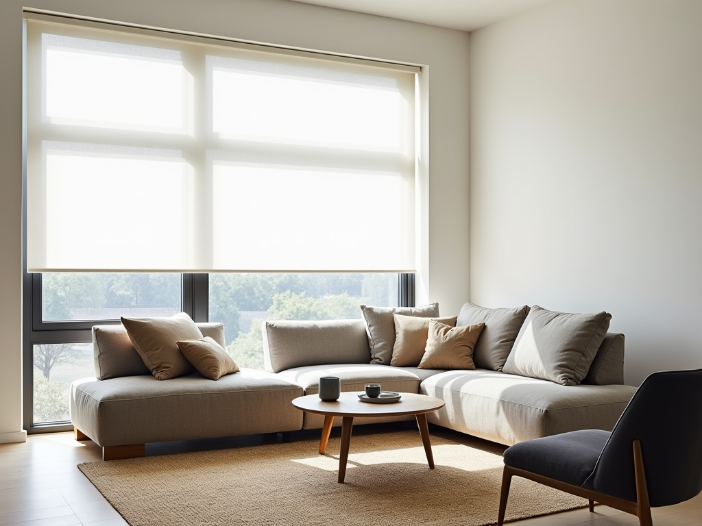
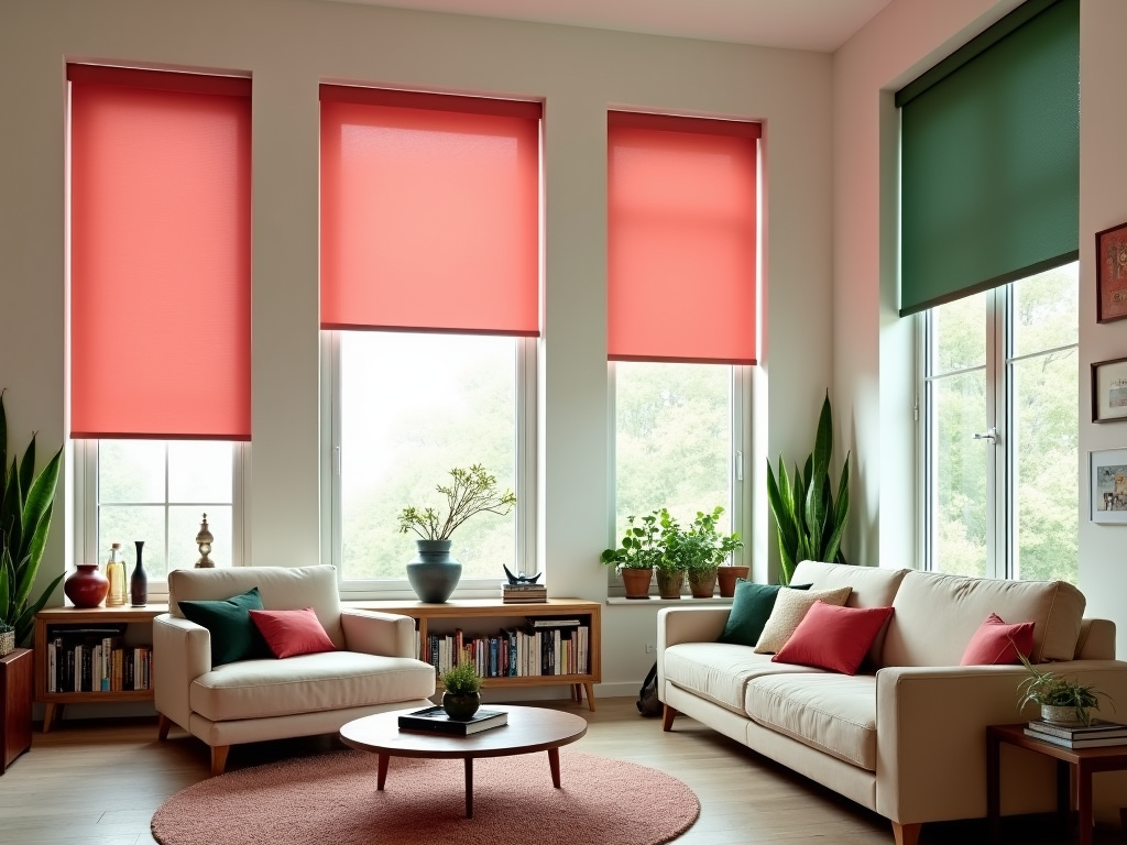
- Vivid tones for impact: Bold options like emerald green or deep burgundy can completely transform a room. Use them to introduce a pop of color or highlight an accent theme.
- Balance with walls: Pick shades just slightly lighter or darker than the walls to maintain harmony while giving your windows a soft visual anchor.
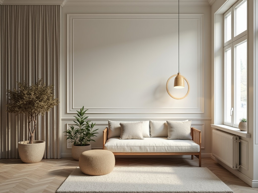
- Bright and airy: Light shades invite sunlight into the space, keeping it open and cheerful. They’re a smart choice for smaller spaces or rooms lacking natural light.
- Privacy with depth: Darker colors block out light effectively, offering enhanced privacy. They’re practical for bedrooms or media rooms but may not be ideal in areas with high heat exposure.
Choose wisely, considering your room’s lighting needs and style preferences. It’s about finding the perfect fit for both aesthetic harmony and everyday usability.
The Ultimate Guide to Choosing Colors for Window Shades or Blinds
Neutral shades like white, gray, beige, and charcoal offer flexibility and elegance, making them ideal for any interior. White roller shades stand out as a favorite. They effortlessly blend with architectural details like window trims and walls, creating a seamless look. Plus, they’re easy to clean and don’t highlight dust as much as darker tones.
Gray shades, including charcoal and greige, strike the perfect balance between light and dark. They’re suitable for both light-filtering and room-darkening purposes, offering both style and practicality.
Beige, taupe, and off-white are timeless picks for those who want adaptability with a touch of sophistication. These shades pair beautifully with various decor trends and color schemes. To explore more options between shades, blinds, and shutters, check out this helpful comparison guide.
When Bold Colors Take Center Stage
Bold and bright shades like blue, green, gold, and purple can instantly transform a room into a captivating space. These striking options go beyond functionality, letting your window treatments double as design features. Think of green evoking lush leaves or blue channeling ocean vibes; bold colors bring a natural, vibrant energy indoors.
Modern and contemporary interiors often look exceptional with these choices. Pair a deep royal blue shade with sleek, neutral furniture to create a balanced yet attention-grabbing look. Gold blinds can add a luxe finish to minimalistic spaces, while a rich purple works beautifully in eclectic settings.
If you’re still debating whether bold blinds or curtains suit your space, read about what works best for your window treatments. Bold colors aren’t just functional—they’re transforming interiors.
Harmonizing Window Shades with Interior Design
Coordinating window shades with your wall colors is a simple way to create a unified, harmonious look. Opting for shades or blinds slightly lighter or darker than your walls adds depth without overpowering the room’s design. For example, soft gray blinds against darker gray walls provide a subtle contrast that feels polished yet cohesive.
Tying your window treatments to other key elements in the room—like cabinets, flooring, or furniture—can elevate your overall aesthetic. Woven wood or faux wood blinds are perfect if your space features natural wood tones. These will enhance the room’s organic ambiance. In more modern spaces, sleek aluminum or vinyl blinds can complement similar finishes on furniture or light fixtures.
To avoid making your home appear visually cluttered, keep consistency in mind when selecting your window treatments. You can use a similar style of shades or blinds throughout your home while varying the colors to suit each room’s vibe. For instance, you might choose neutral blinds for living spaces and richer tones for bedrooms. This approach ensures that each room feels distinct yet cohesive within the flow of the entire home design.
If you’re uncertain what will suit your needs best, this guide to choosing window blinds could help you decide. It’s all about achieving a balance that enhances your home without overpowering your personal style.
Color Choices That Influence Light and Energy Efficiency
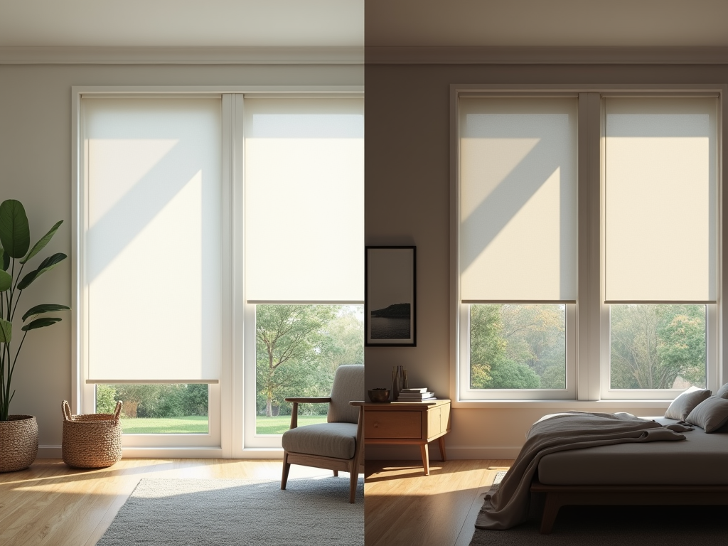
Lighter shades like white, cream, and gentle pastels excel at reflecting natural light. They’re perfect for small spaces or areas where you want a brighter feel, such as kitchens or living rooms. These colors don’t just visually expand a room; they also help reduce reliance on artificial lighting during the day. If you’re wondering why blinds are such a popular choice for living spaces, take a look at this helpful comparison on blinds versus curtains.
Darker shades, on the other hand, thrive in areas where privacy and light control matter most. Blackout or deep-toned blinds are ideal for bedrooms, nurseries, or media rooms, where blocking light completely is a priority. Their ability to reduce glare makes them functional without sacrificing aesthetics. But keep in mind, while dark blinds provide superior coverage, they can increase cooling needs during warmer months.
Color impacts energy efficiency, too. Pale tones reflect heat, keeping rooms cooler and helping you cut down on air conditioning bills in the summer. In contrast, darker blinds absorb heat, which might work in winter to retain warmth indoors but could amplify cooling demands in hotter climates. This balance between light control, privacy, and energy needs is key to selecting the right color for your shades or blinds.
Staying Stylish with Popular Color Trends
In 2023, window shade color trends are spotlighting bold yet refined tones that blend versatility with personality. Benjamin Moore’s curated selections feature standout options like Raspberry Blush, a vivacious coral-red that energizes any space, and Conch Shell, a soft pink perfect for adding understated charm. For those aiming for richer aesthetics, consider Cinnamon or Wenge. Cinnamon offers a warm, earthy feel, while Wenge, a deep and dramatic brown, lends sophistication to modern interiors.
Muted tones like New Age—gentle lavender and greys—are an excellent choice for minimalist or contemporary designs seeking a subtle layer of depth. Savannah Green steps in as an adventurous counterpart, bringing vibrancy to spaces craving a natural pop of color without overwhelming the room.
Incorporating Trend-Driven Shades
To incorporate these trend-driven shades, match window blinds or shades to your broader design palette:
- In rooms with neutral furniture, bold colors like Raspberry Blush can make your windows the focal point.
- For more balanced elegance, muted shades like Conch Shell or New Age tie easily with soft-toned walls.
Room Lighting and Practical Considerations
Selecting the right color also depends on practical considerations, including room lighting and purpose:
- Darker hues like Wenge enhance coziness but require sufficient natural light.
- Brighter tones like Savannah Green elevate spaces that feel a bit dim.
Explore whether you should opt for blinds or curtains by reading this helpful guide.
Sources:
A Shade Above NJ – What Color Should My Roller Shades Be
Architecture Lab – What Color Should Your Window Blinds Be
Norman USA – 2023 Window Treatment Color Trends
Decorilla – 6 Window Blind Color Tips